ELLO!
App For The Deaf
Sight, Hearing, Taste, Smell and Touch, we as humans rely on all our five basic senses to go about our daily lives, each sense sends information to the brain to help us understand and perceive the world around us. Imagine a world without sound and the constant defeat of not being able to express what you need or feel to others.
Deaf culture is a sense of community among deaf people. Many of them don’t view their deafness as a disability. Their community depends on Sign language, which is a completely developed language and contains all the fundamental features of language. The difficulty appears when encountered with hearing people, as many are unfamiliar with sign language, hence, building a communication barrier. The deaf always have to rely on another person to interpret for them. Also the fact that the hearing people are not deprived of the sense, they tend to get impatient and feel awkward or frustrated trying to communicate with the Deaf, especially when no interpreter is available, which makes the Deaf people feel isolated. A solution should be devised to help the deaf in their everyday encounters, which would enable them to have better conversation that too independently.
Communication plays a vital role in human life. It not only helps to facilitate the process of sharing information and knowledge, but also helps people to develop relationships with others and express their ideas and feelings, and understand emotion and thoughts of others. As a communication designer, I believe I ought to make an effort to help the people who genuinely struggle communicating and change the negative connotation the term “Deaf awareness” itself is associated with, to a more positive meaning.
CONCEPT
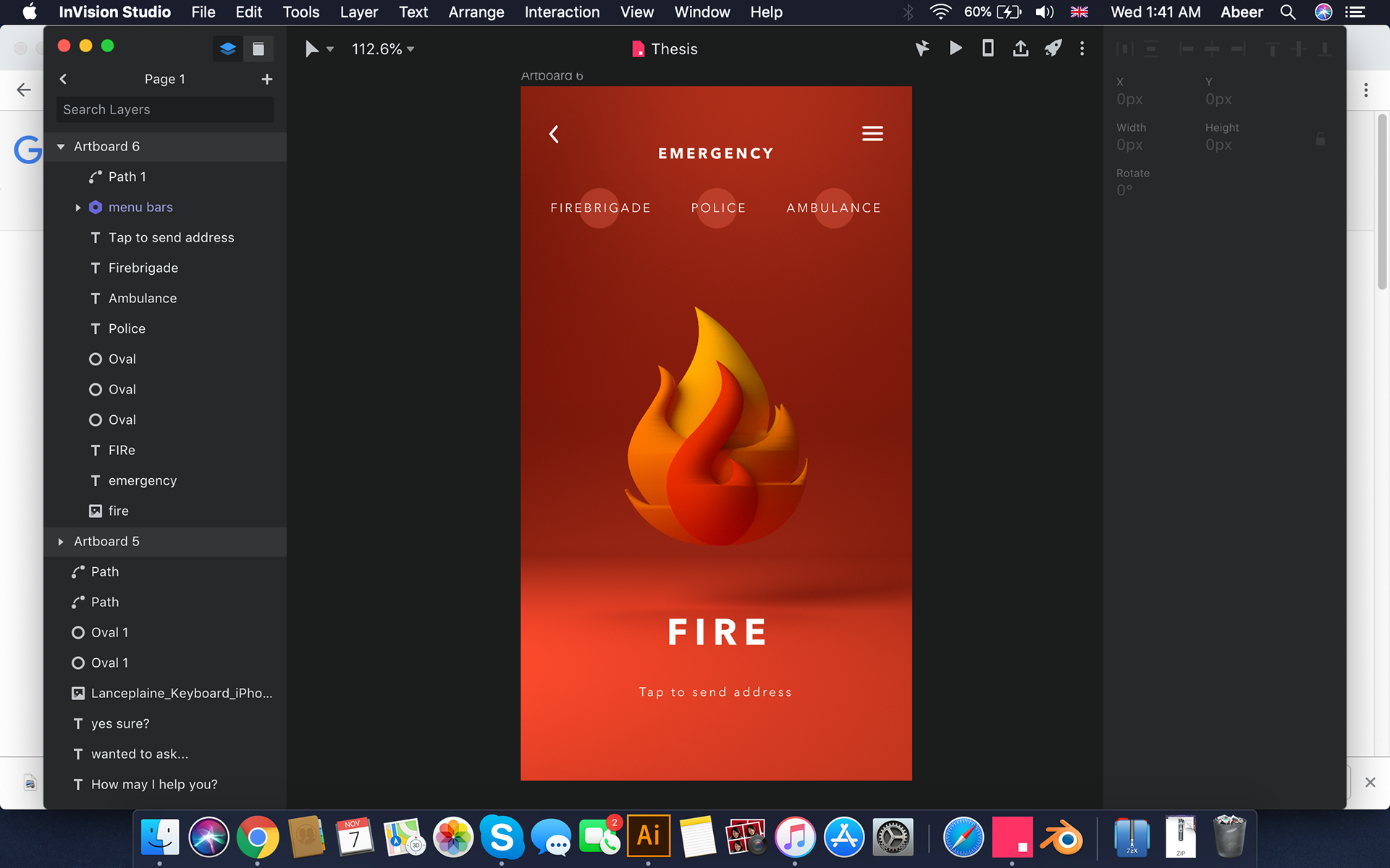
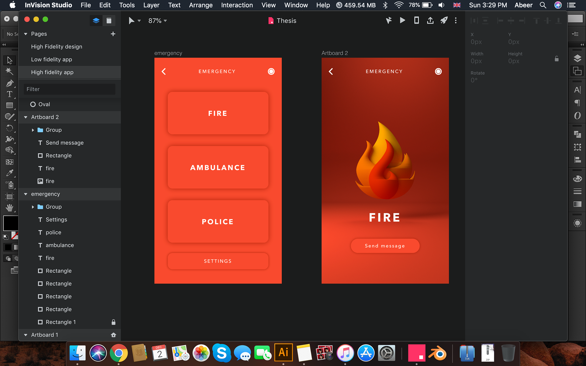
The concept is to design an assistive smart phone application that would aid the hearing impaired people in communicating with the hearing people. Finding a solution meant figuring out a way that is common and understood by both hearing and the deaf. Pictorials are universal; they do not need language and can be understood by both people. Hence, the application’s main feature will be designed based on pictorials, that is, pictorial representation of words or phrases commonly used in our everyday lives, to reduce confusion in their everyday encounters with the hearing people.
brand strategy
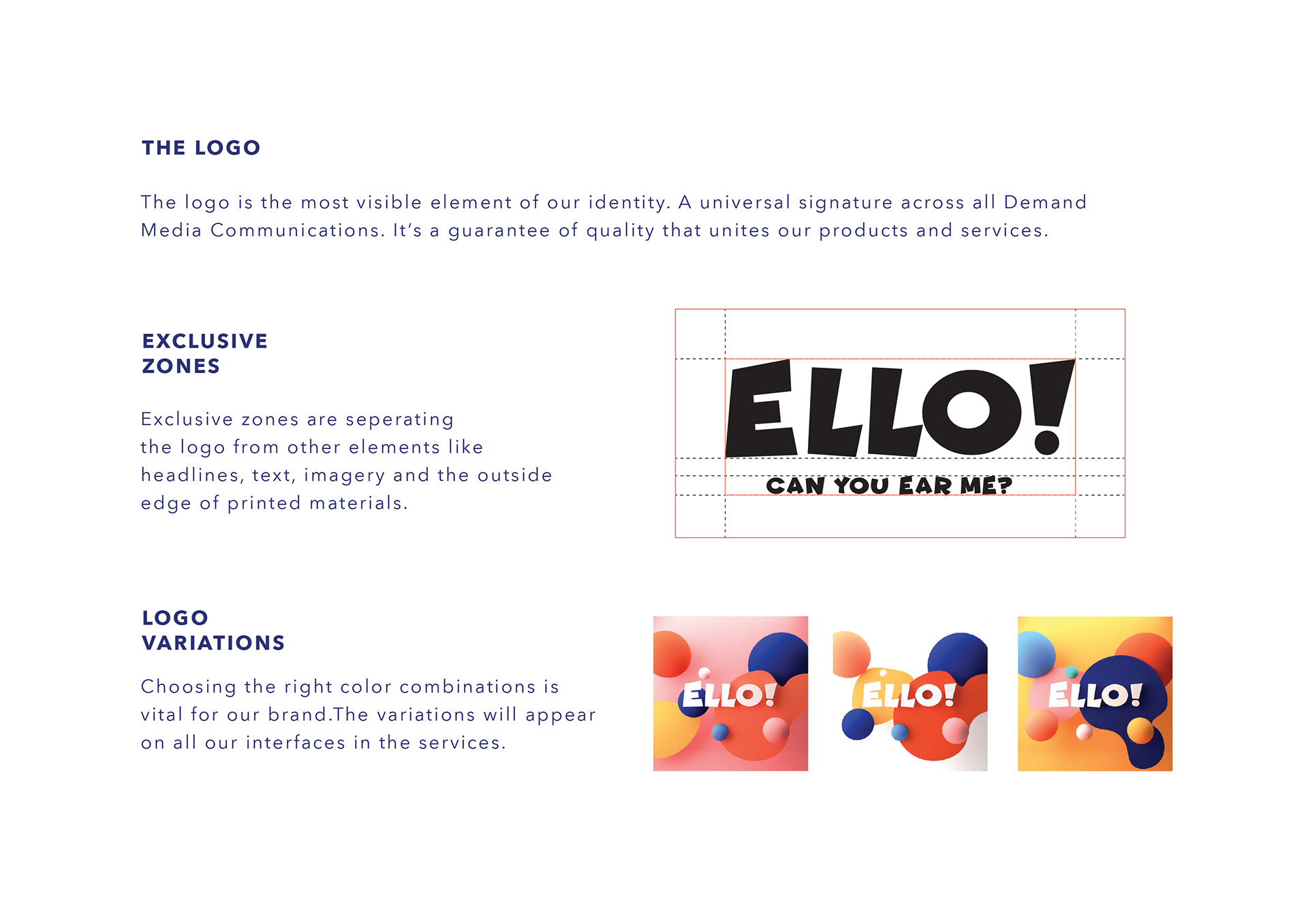
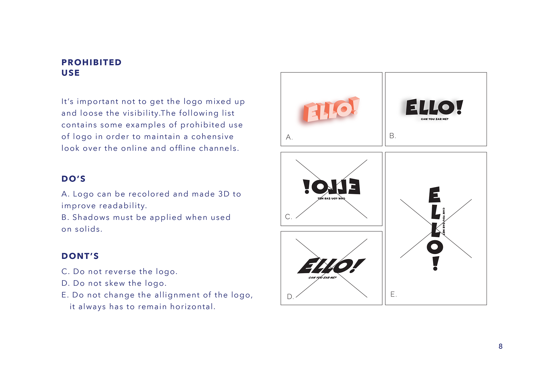
ELLO!
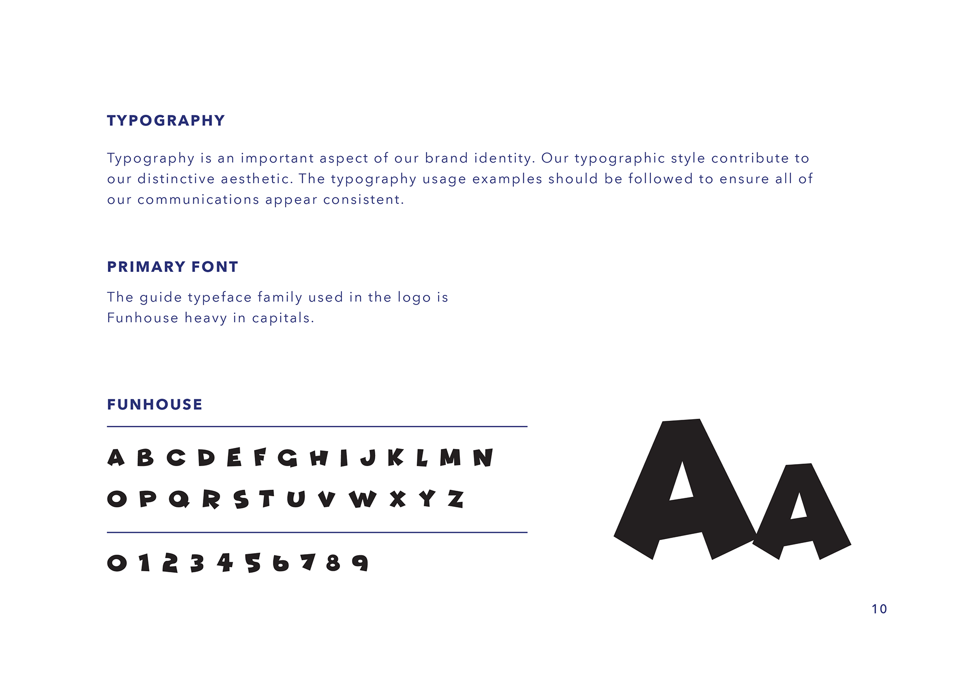
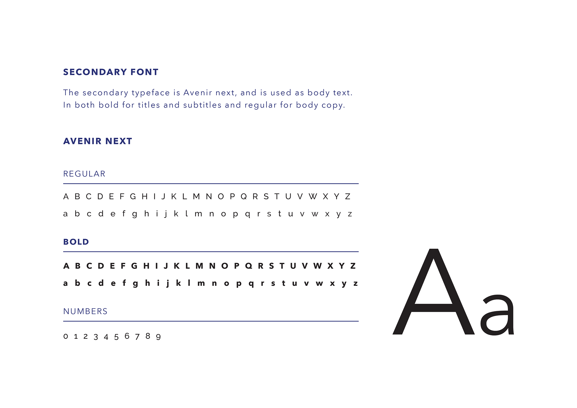
The name of the brand is derived from the word "HELLO", which is the most commonly used greeting, something which is the first thing people say when they meet. (H) - (ELLO), based on the fact that to a deaf person who is used to lip-reading and has never experienced learning through phonetics, is not aware what exactly is the sound of the alphabet "H". When the word "Hello" is said out loud, to a deaf person, who lip reads it, it looks like they are saying "ELLO".
Brand Personality
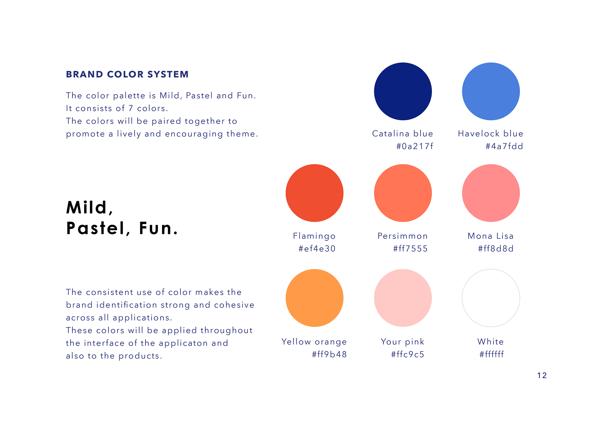
Lively, fun, pleasant, encouraging and positive.

The application
In today’s world, great advancements in technology (smart phones, televisions etc.) have been made which have proved to be of help to the deaf community.Taking advantage of the advancements, I have worked towards designing an assistive smart phone application for the deaf which would aid both short, quick and long communication, or as simple as asking for directions. Also will be utilizing the fact that the Deaf have strong Visual information processing. The main objective of my work is to make this application effortlessly accessible and also amusing to have as a part of their daily lives.
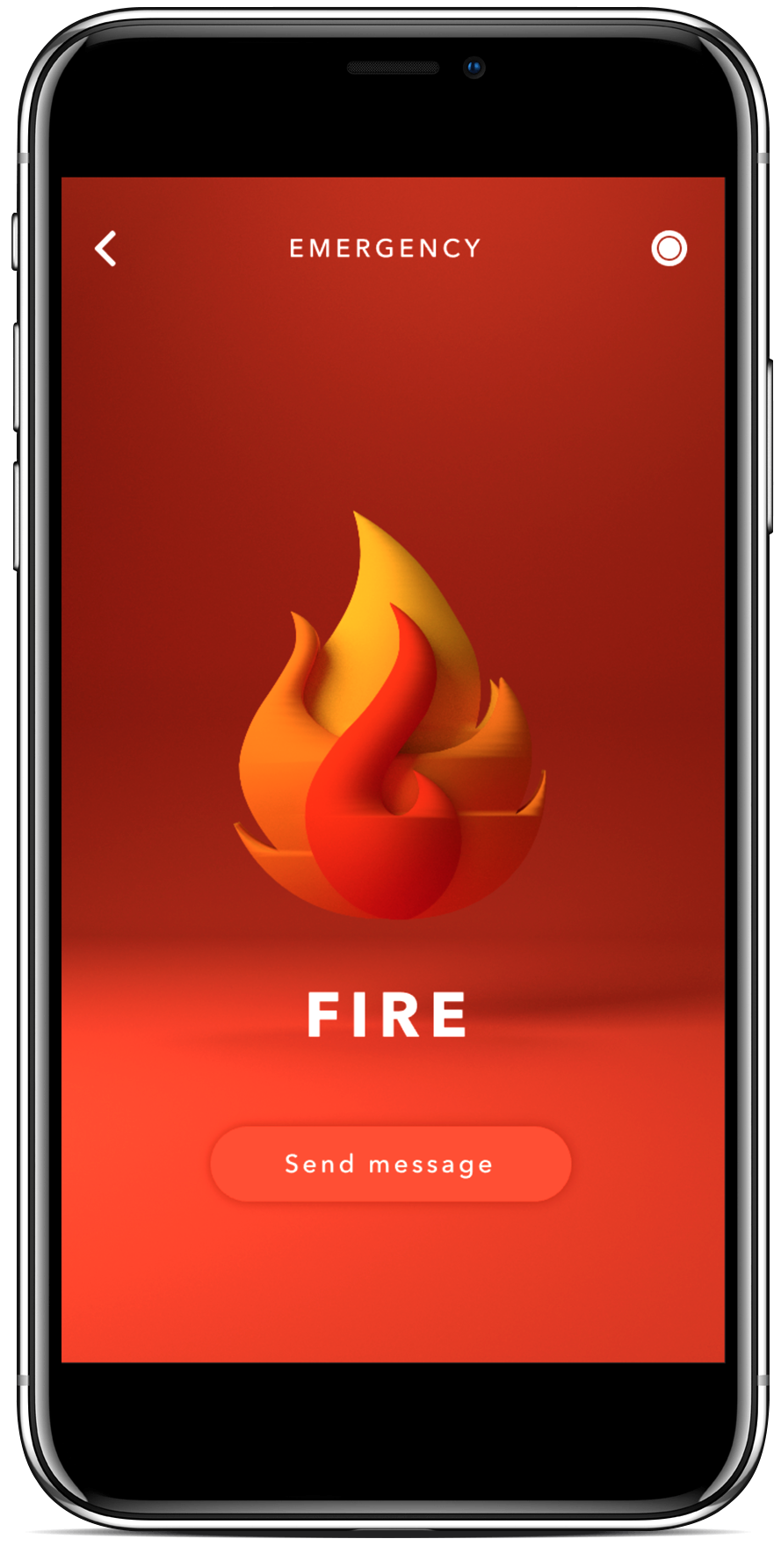
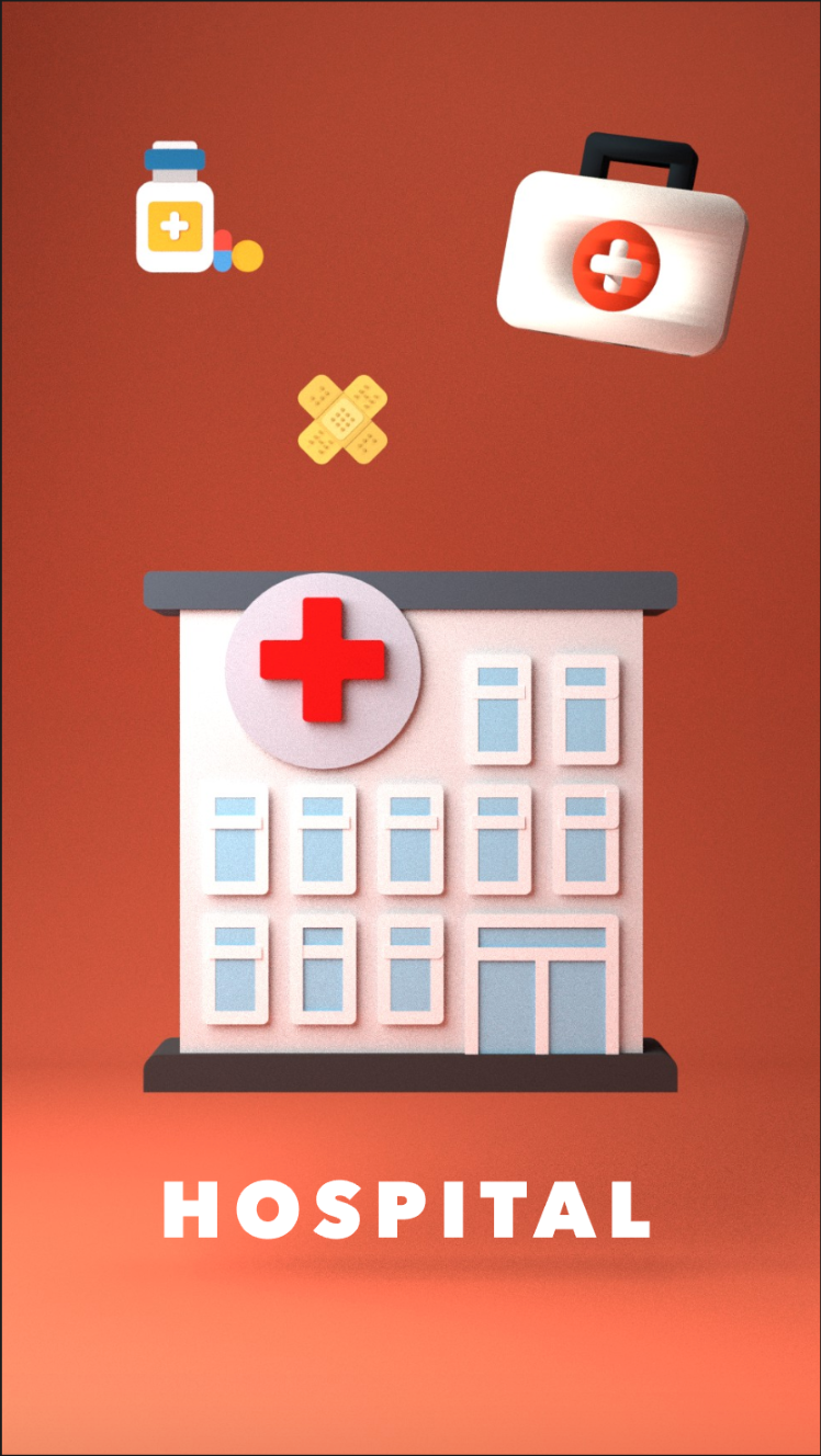
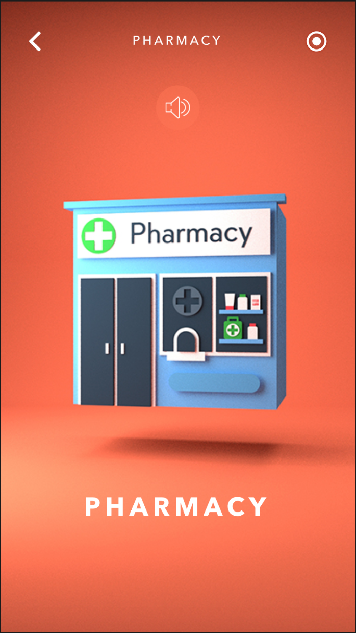

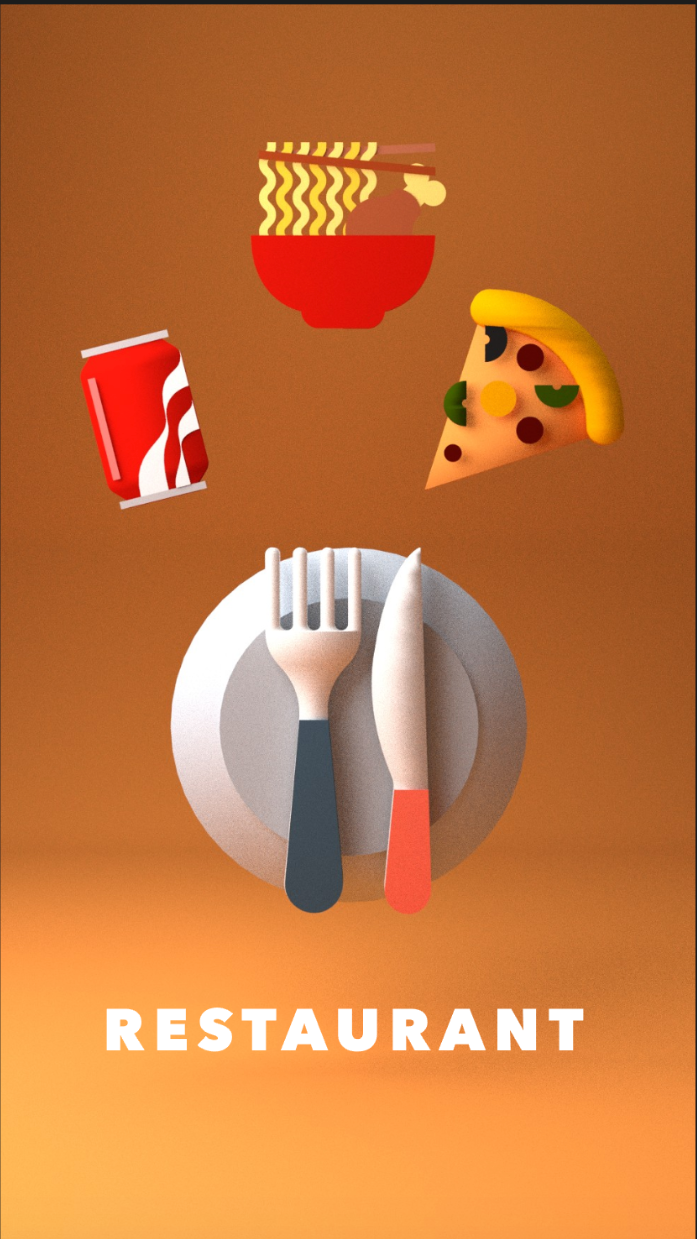
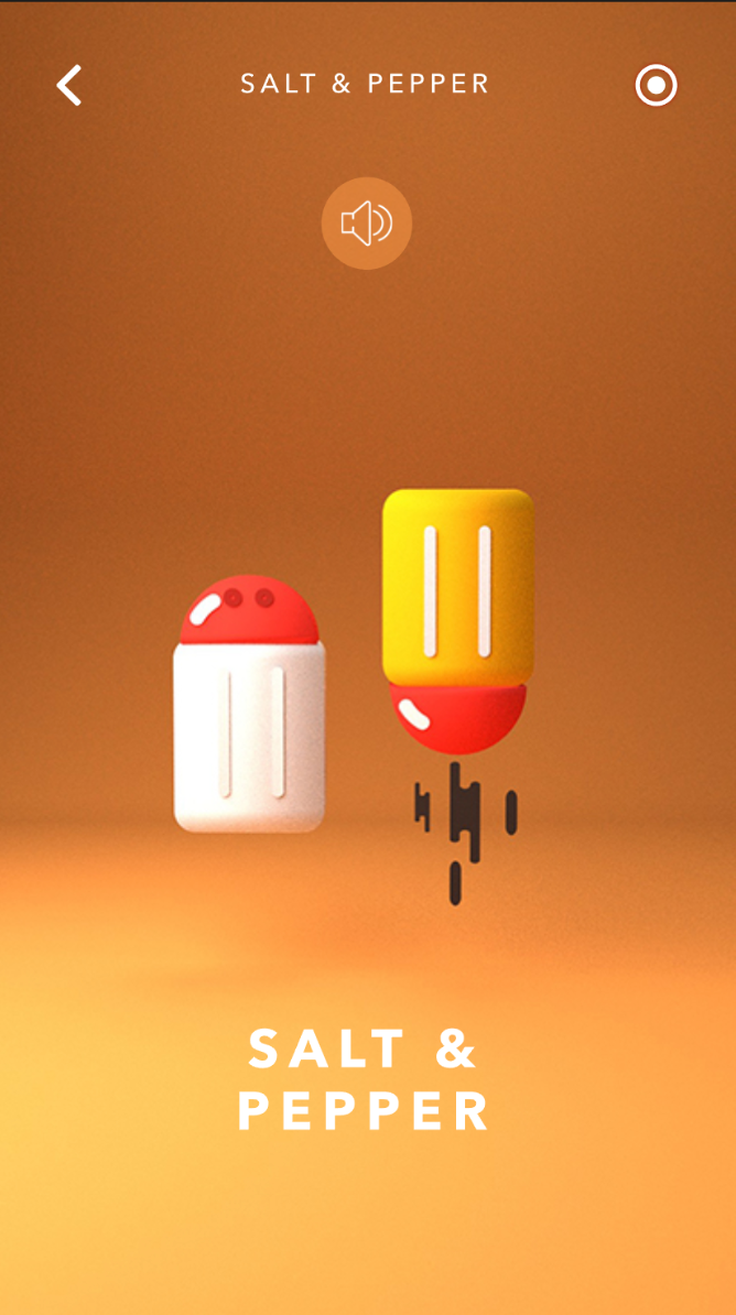
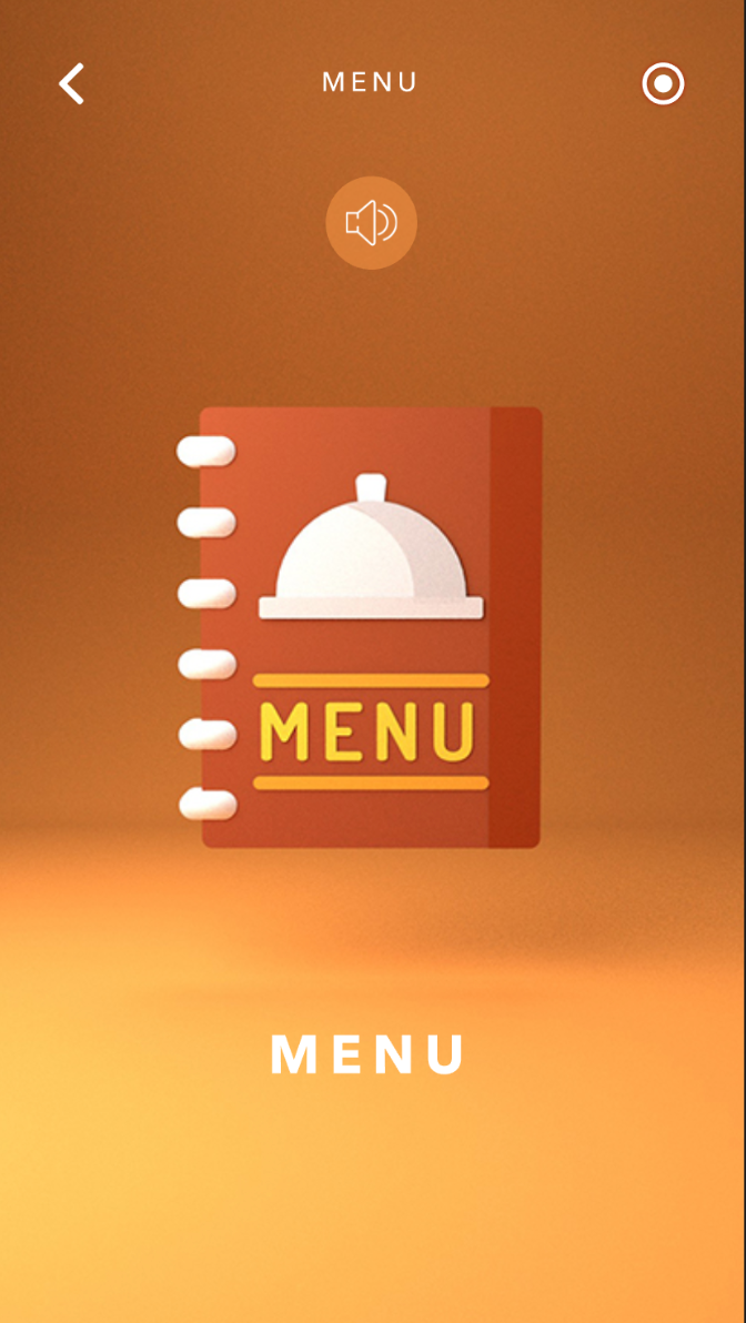

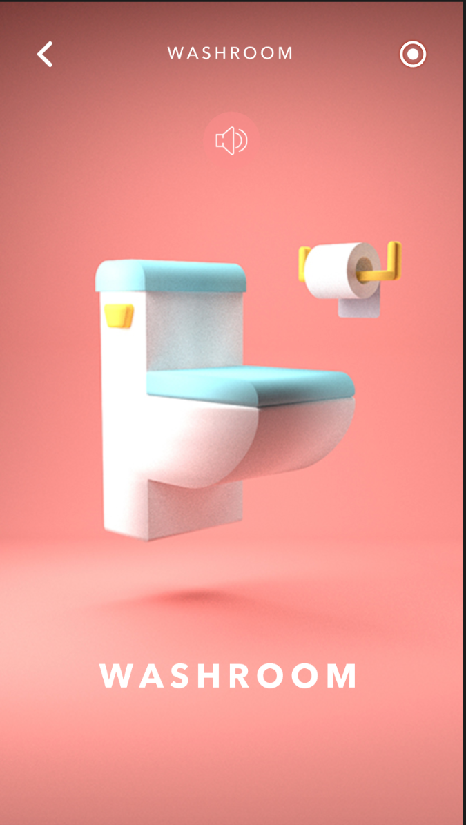
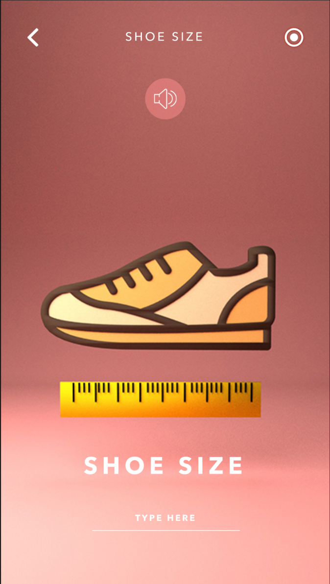
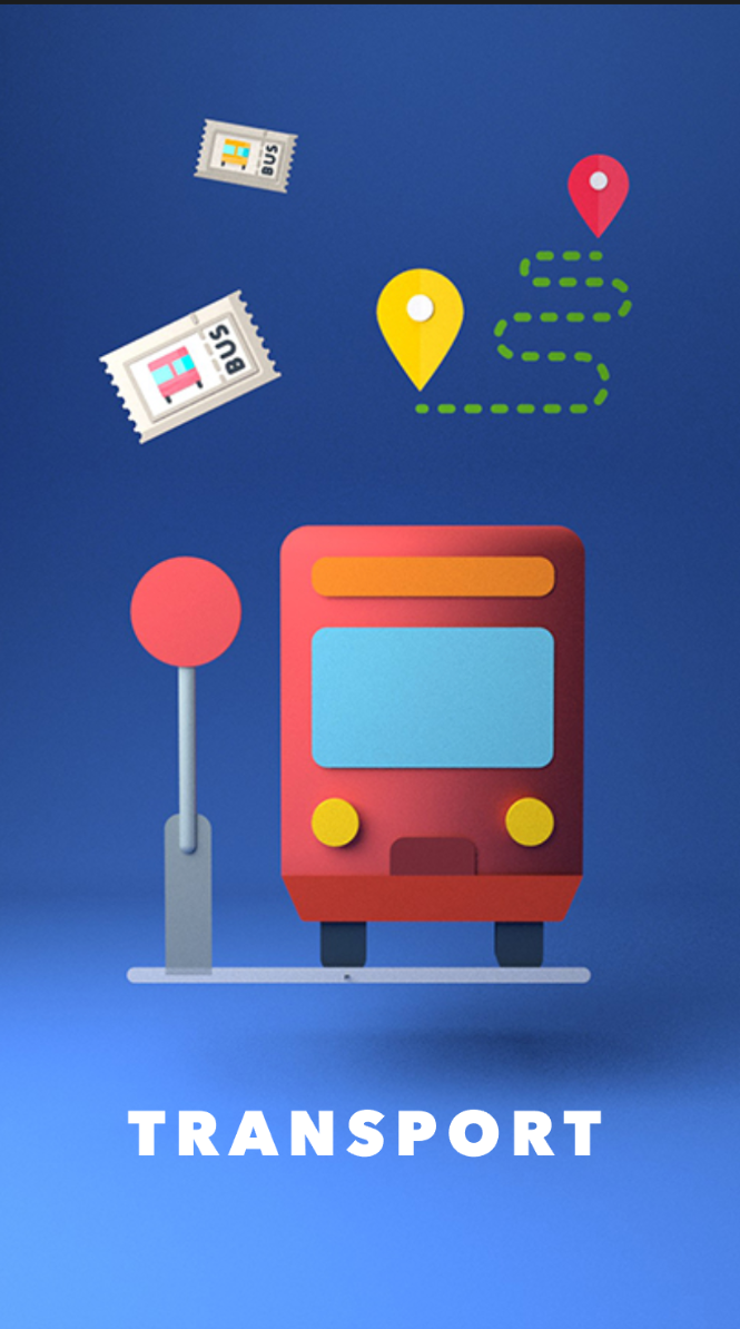
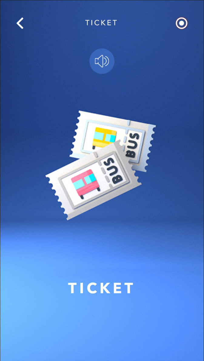
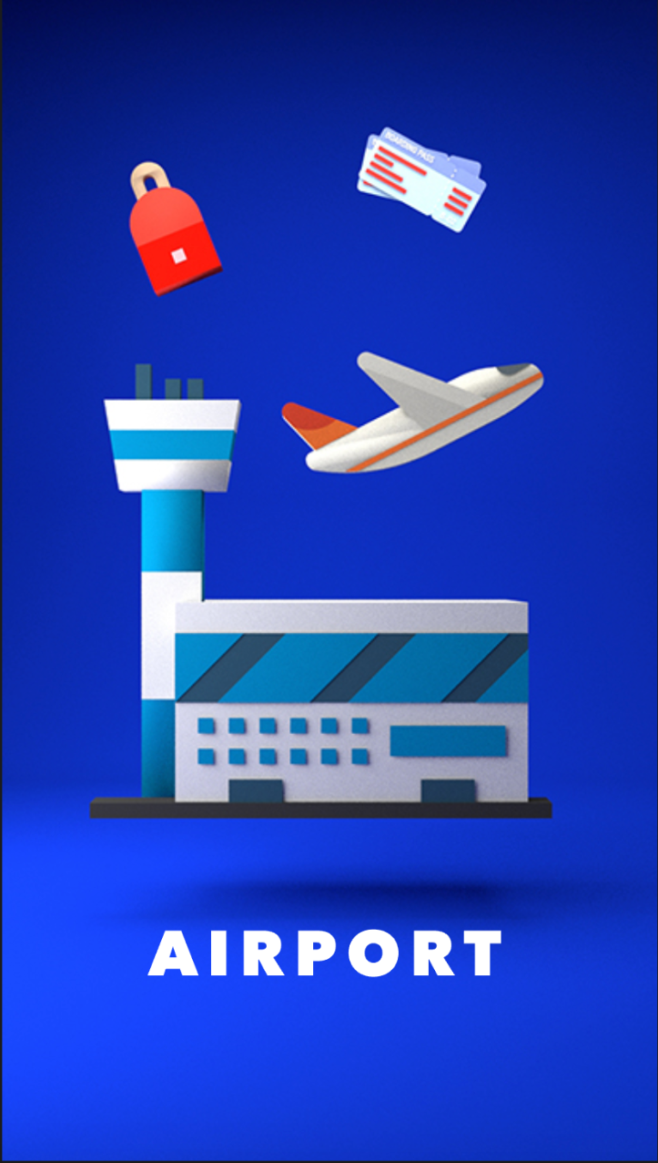
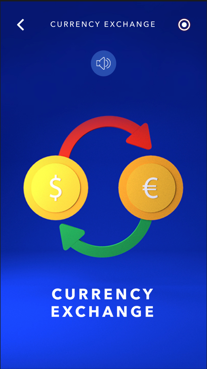
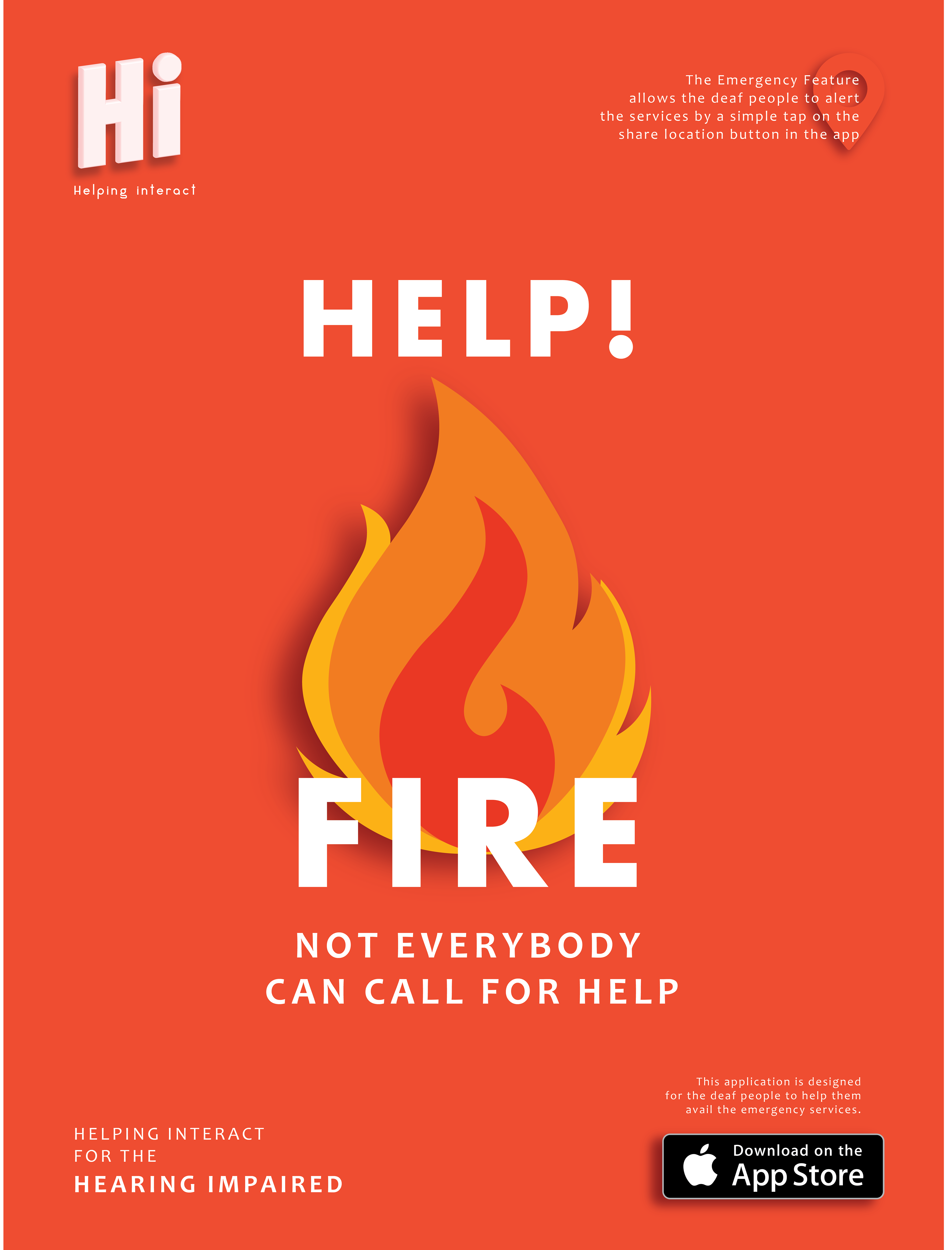
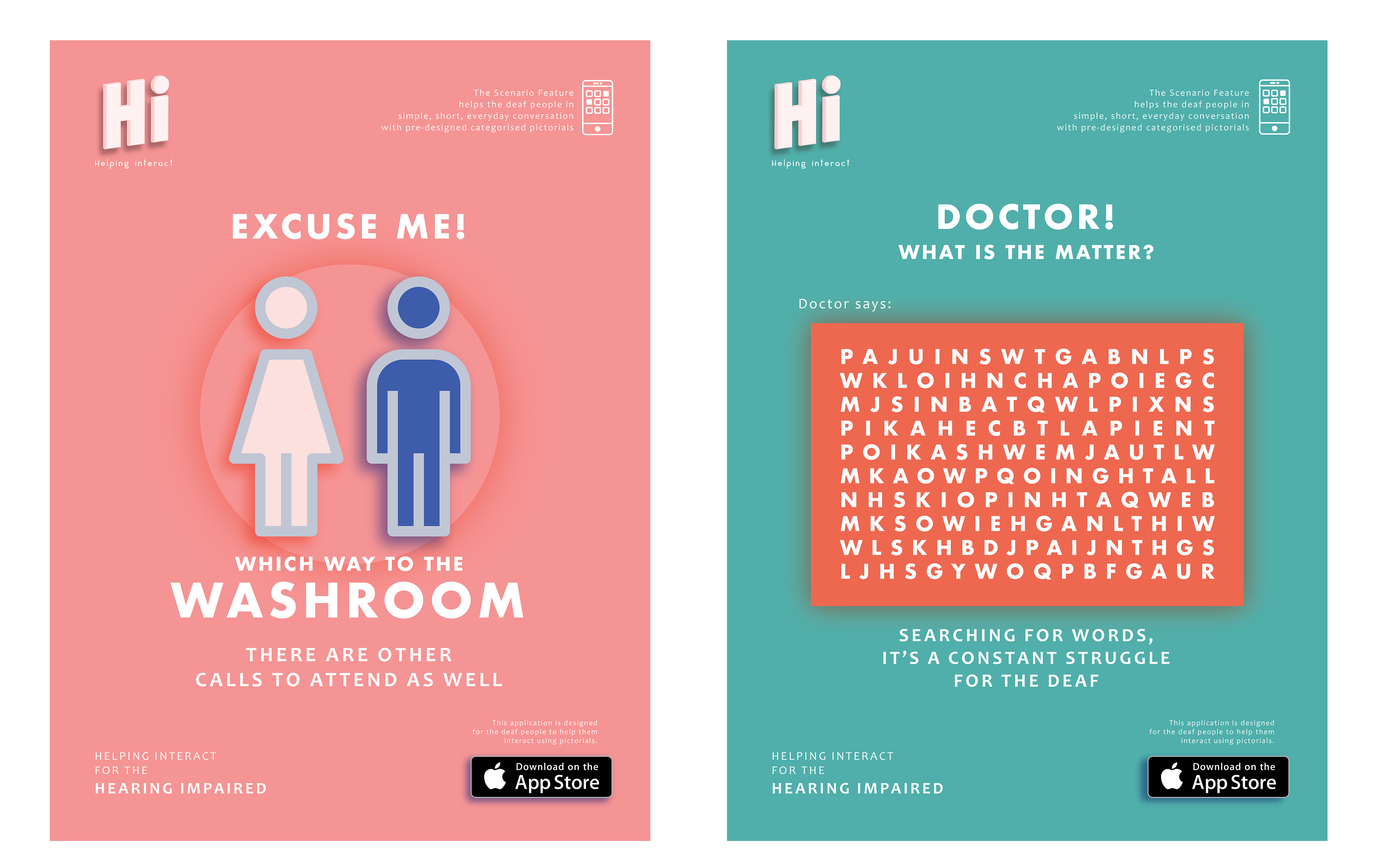
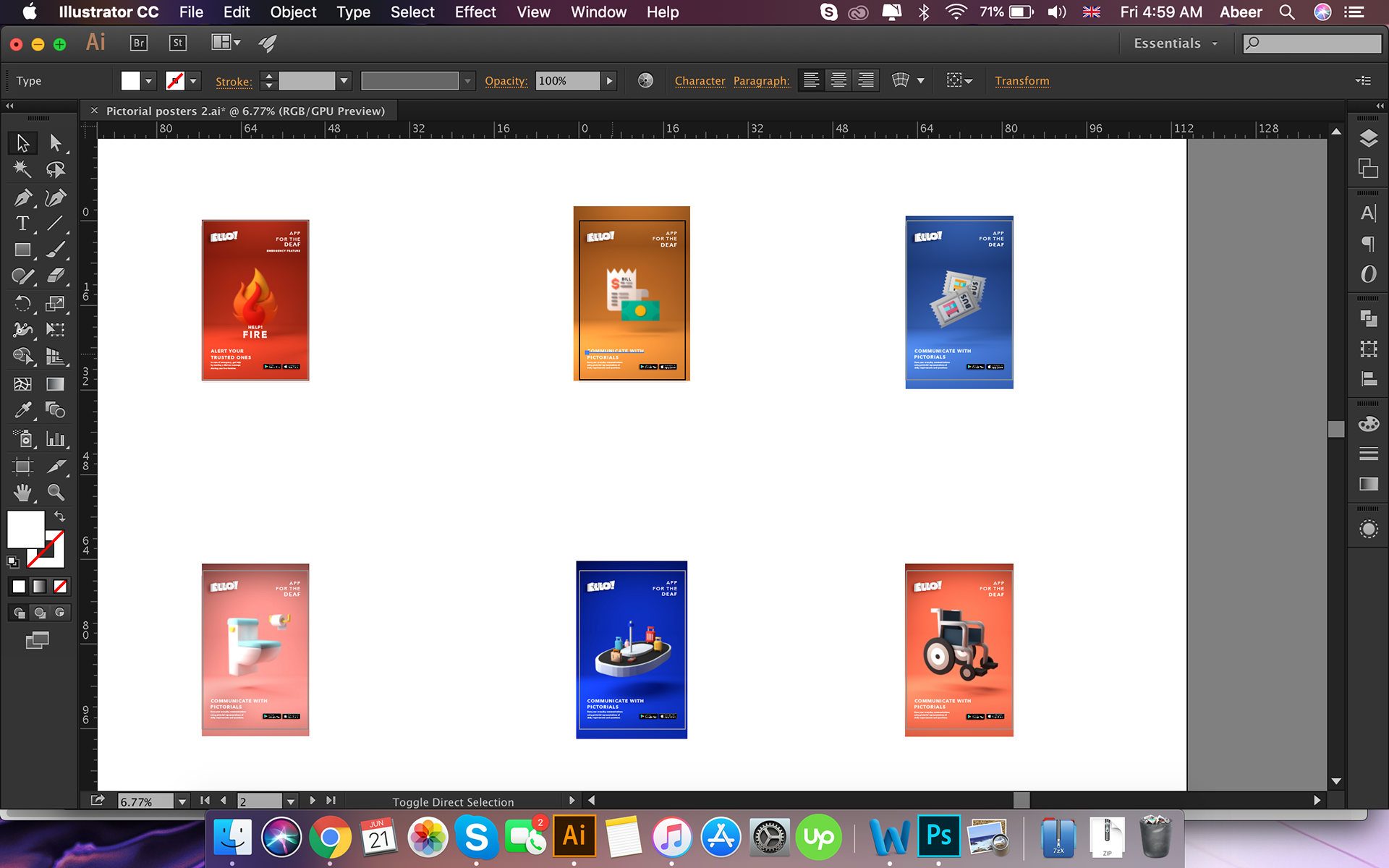
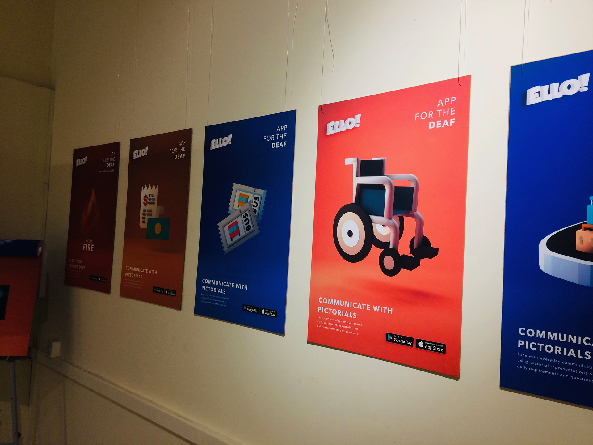
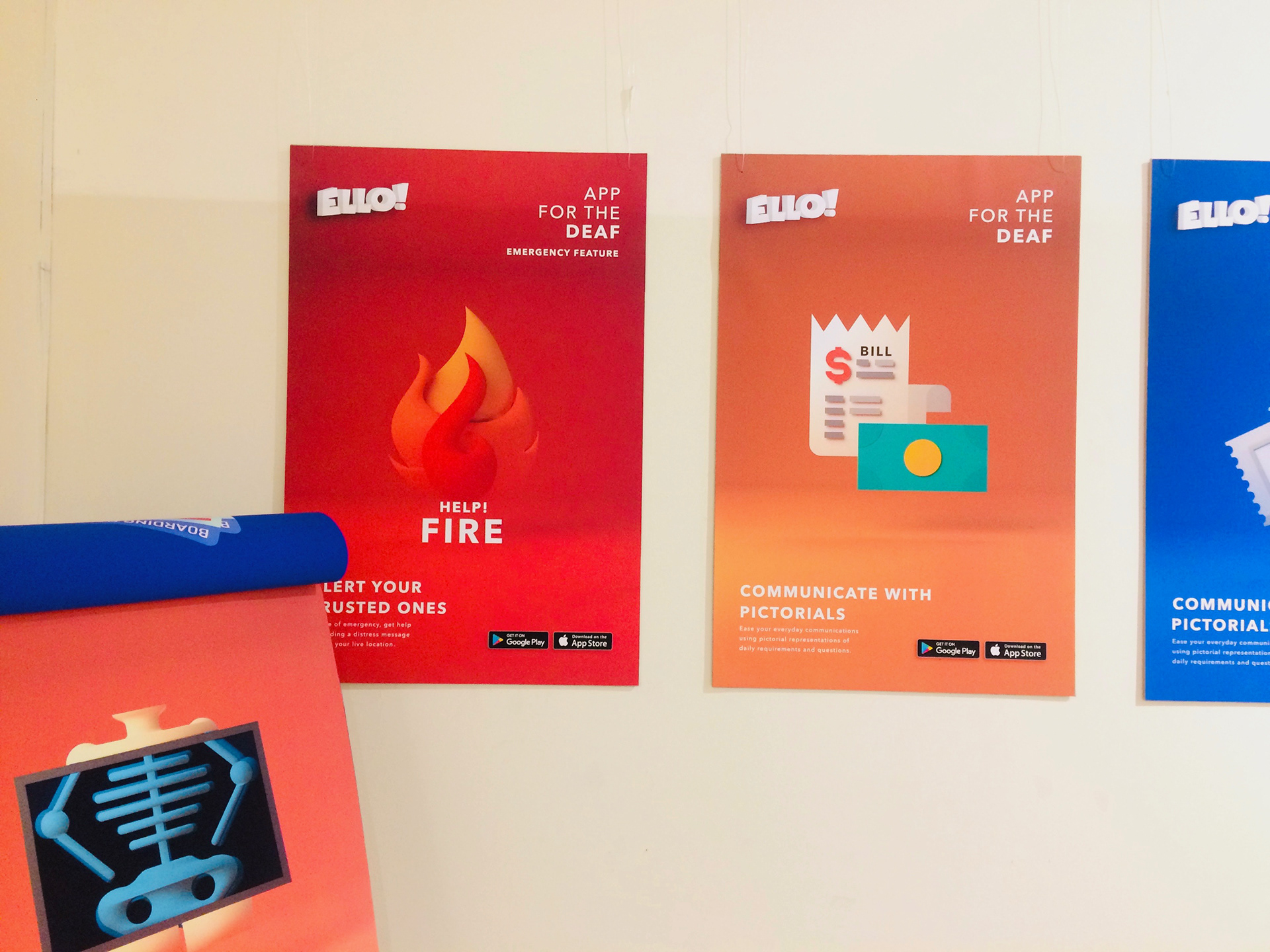
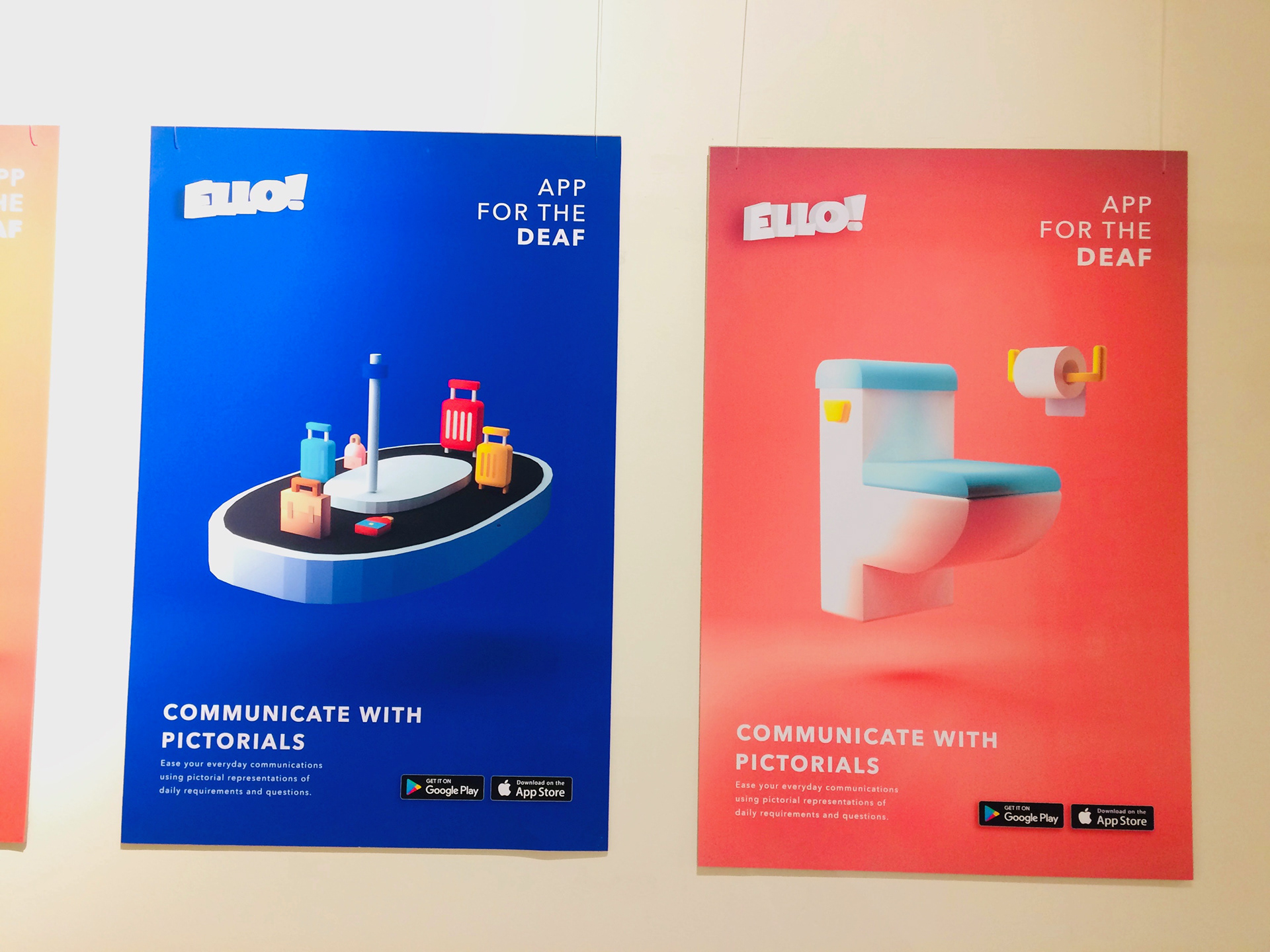
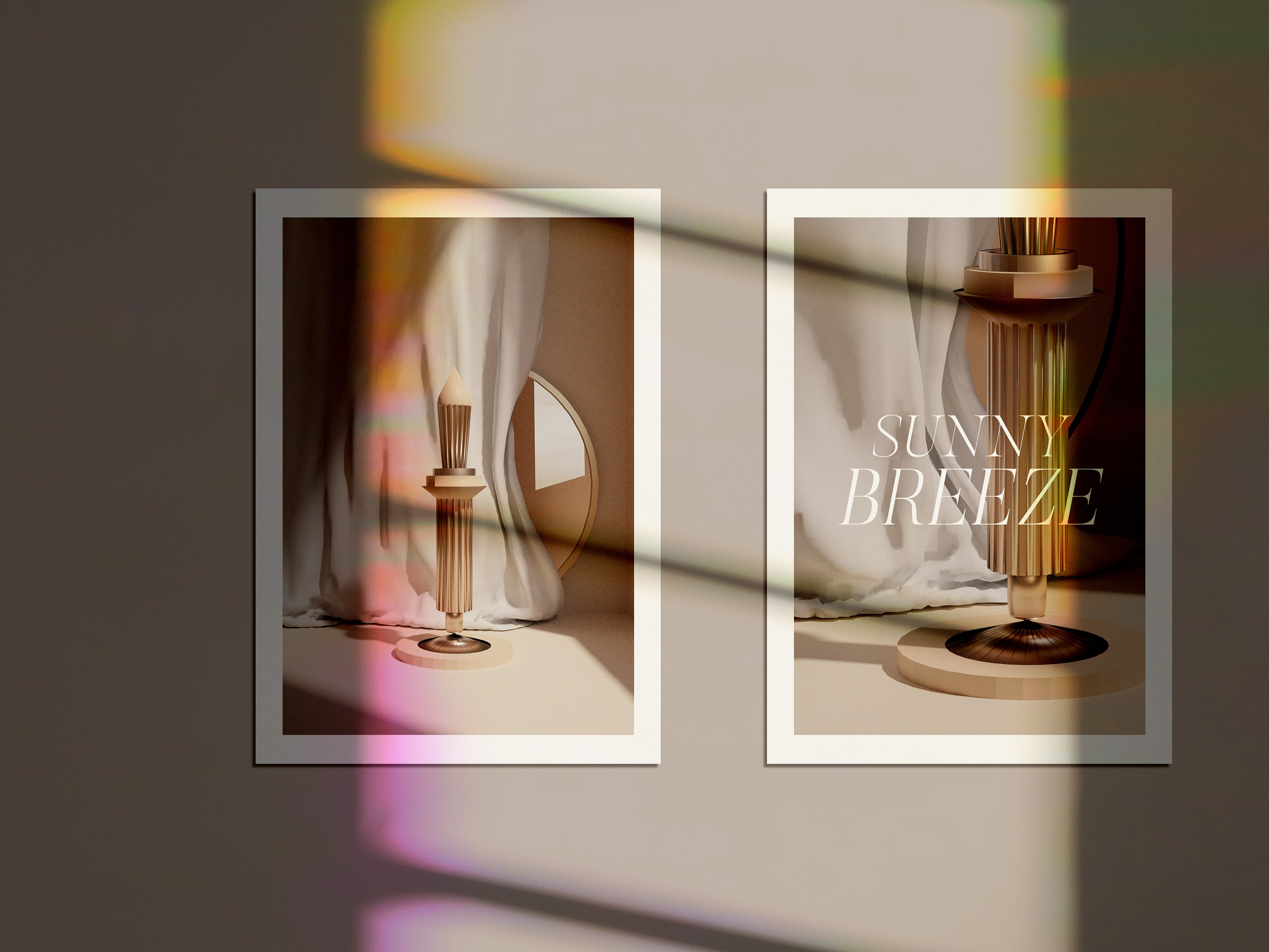
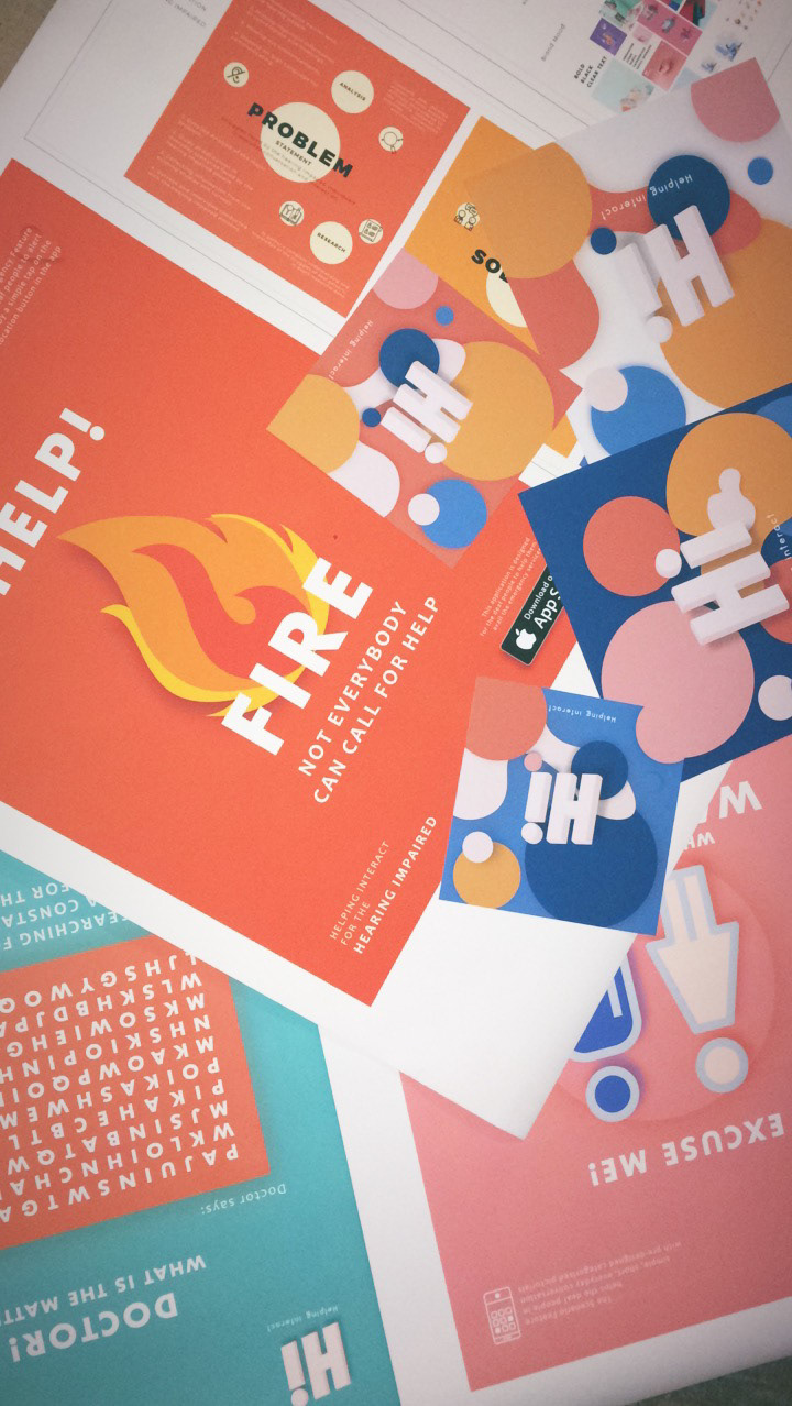
Poster Designs
Research Methodology
For effective analysis the methodology of my research was both Quantitative and qualitative.
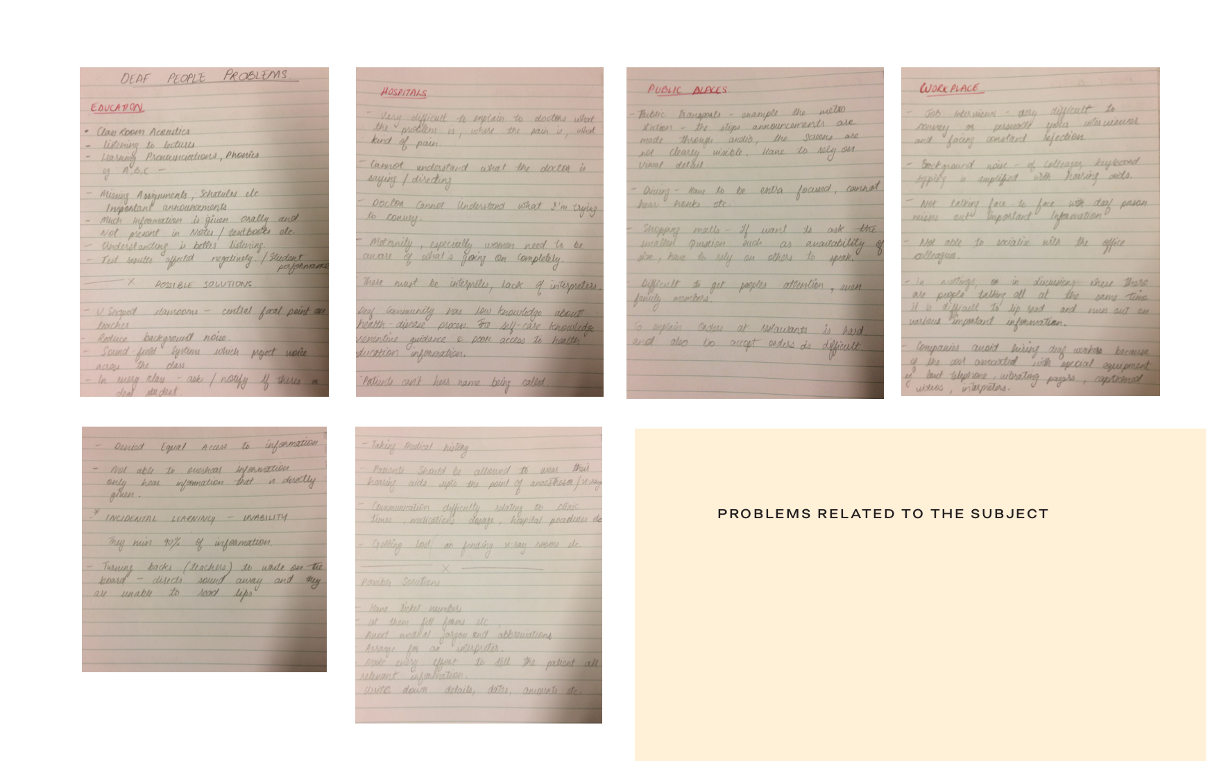
In quantitative, the data was collected through firstly studying the previously conducted surveys and studies. For gaining knowledge, which was useful for my project, I conducted surveys myself. Formed a questionnaire asking questions related to my problem, and finding out details that would help me solve in the way that I had figured out. Categorical analysis of daily routines and the difficulties faced in them by the Deaf.
Qualitative research was to acquire personal insight and to know from the people themselves individually about their experiences. For this I had managed informal interviews, and the people I met with were:
An art teacher at the National Special Education Centre For Hearing Impaired Children. Her other family member who were also deaf.
KFC Rawalpindi commercial market branch staff member.
Fellow students at National College of Arts.
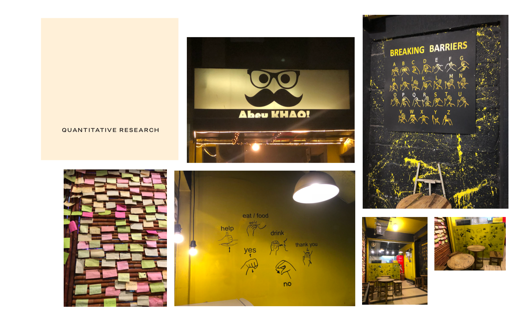
Owners and workers of restaurant named ‘Abey khao’. This restaurant is based on sign language, the customers have to order in sign language.

Process
To every process there is a rough, concept framework made to clear things out and to have a proper plan for execution.
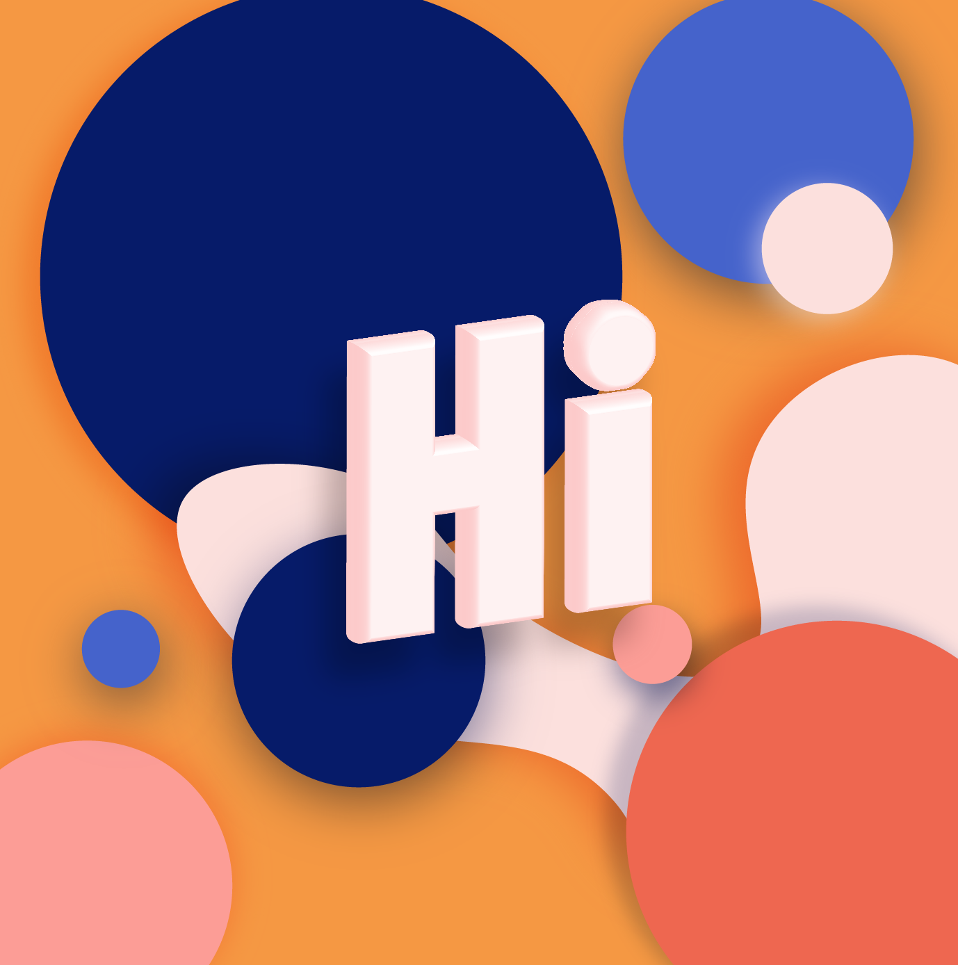
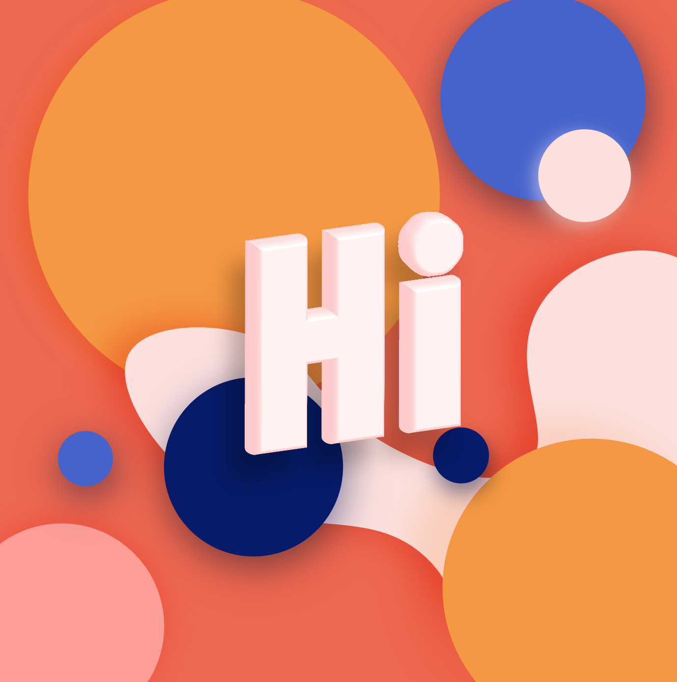
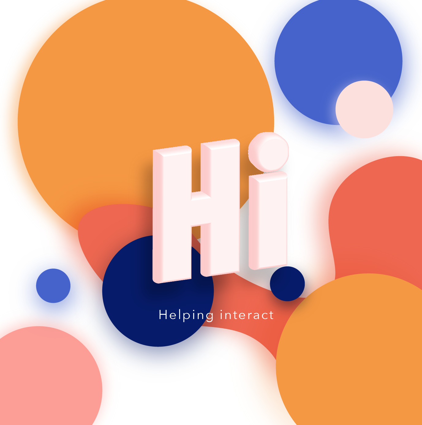
Beginning with the Identity and Design: The first step was to think of an appropriate strategy that would run the entire brand. Brainstorming for the right name so that it is relatable to the audience. Began with the name "HI", which stood for "Helping Interact".
The soft wares used are:
Adobe Illustrator - Identity Design, style guidelines, Initial flat vector designs, Poster Designs, App basic wire-framing.
Adobe Photoshop - Image treatments.
Adobe Premier - Video editing and compilation.
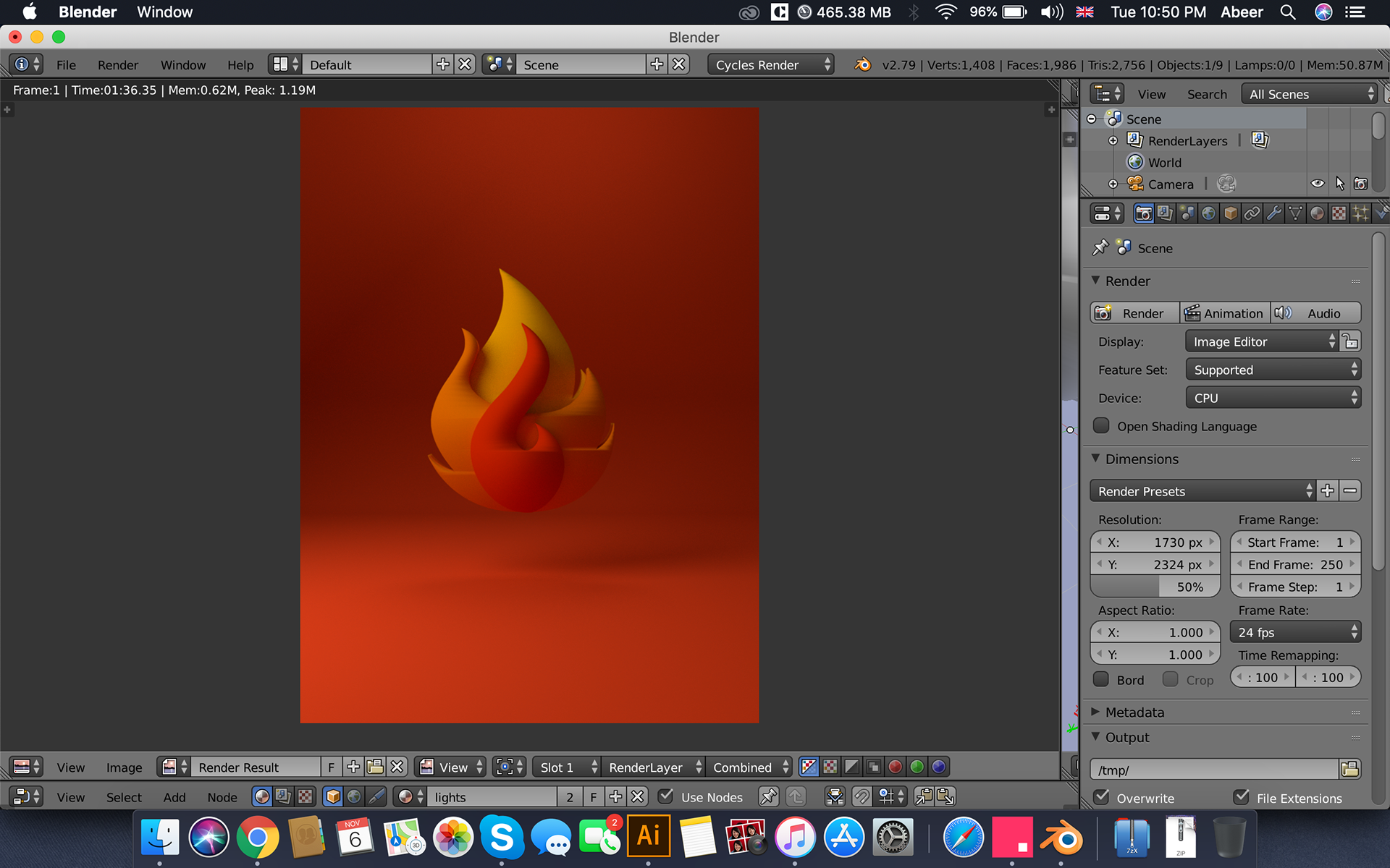
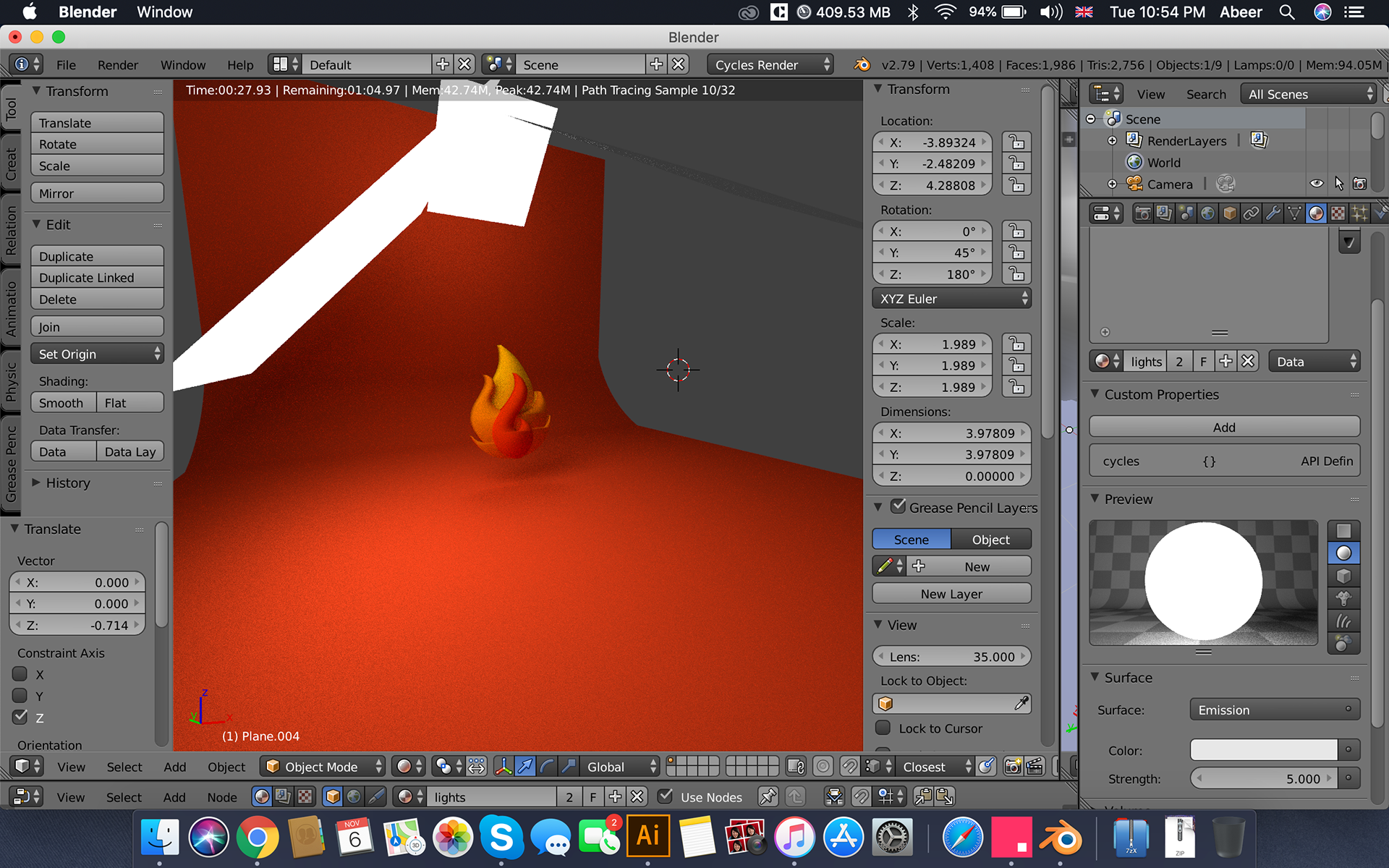
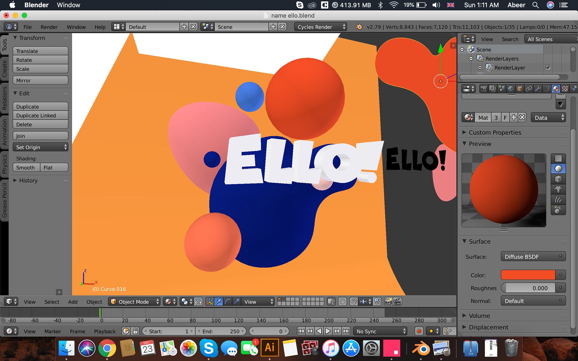
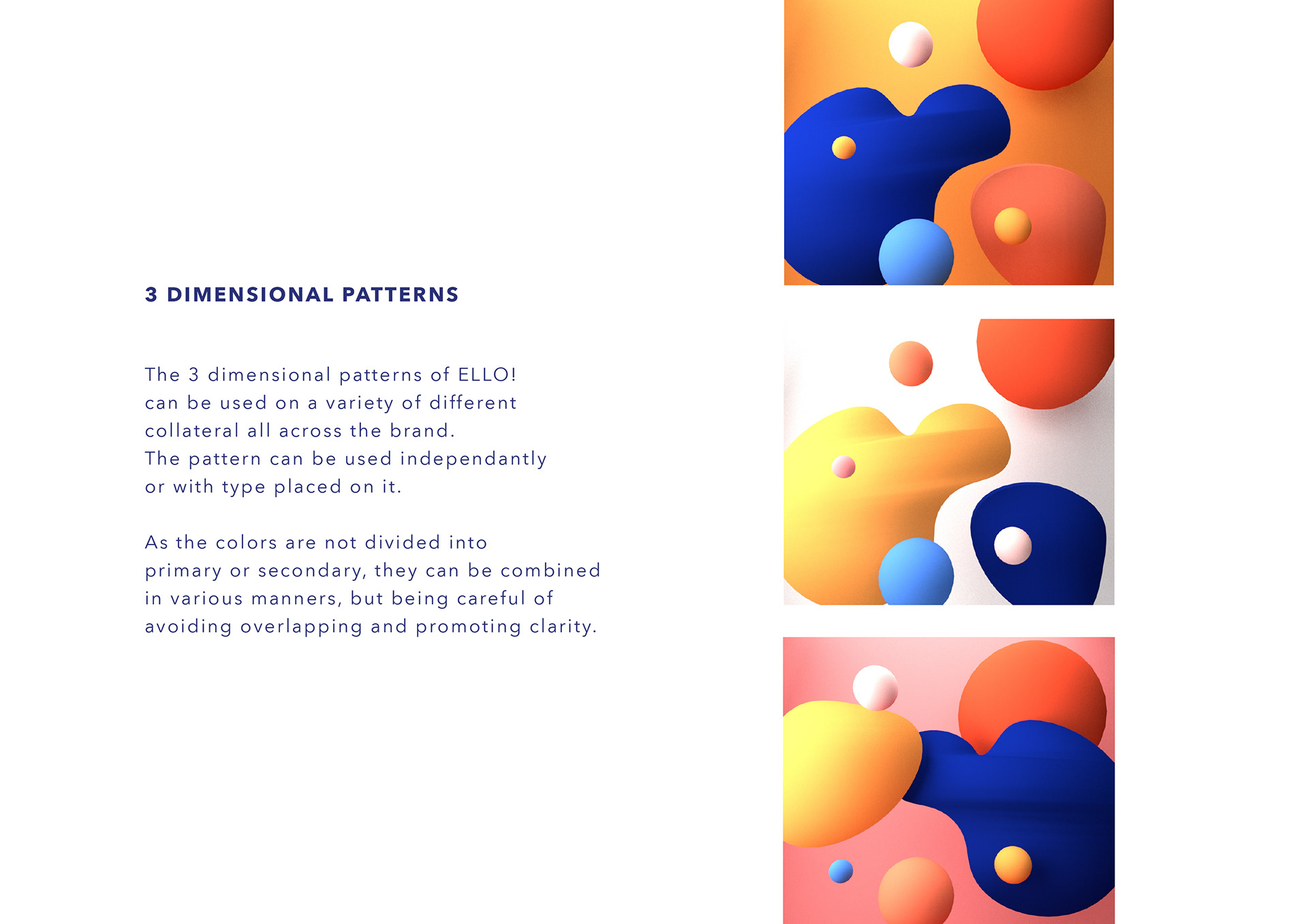
Blender - 3d Designs Identity, patterns and all pictorials.
Listing content for all the pictorials, carefully deciding what phrases that are important need to be made as imagery, for each category.
Concept sketches of the main screens of the application.
Making wireframes digitally based on the concept sketches.
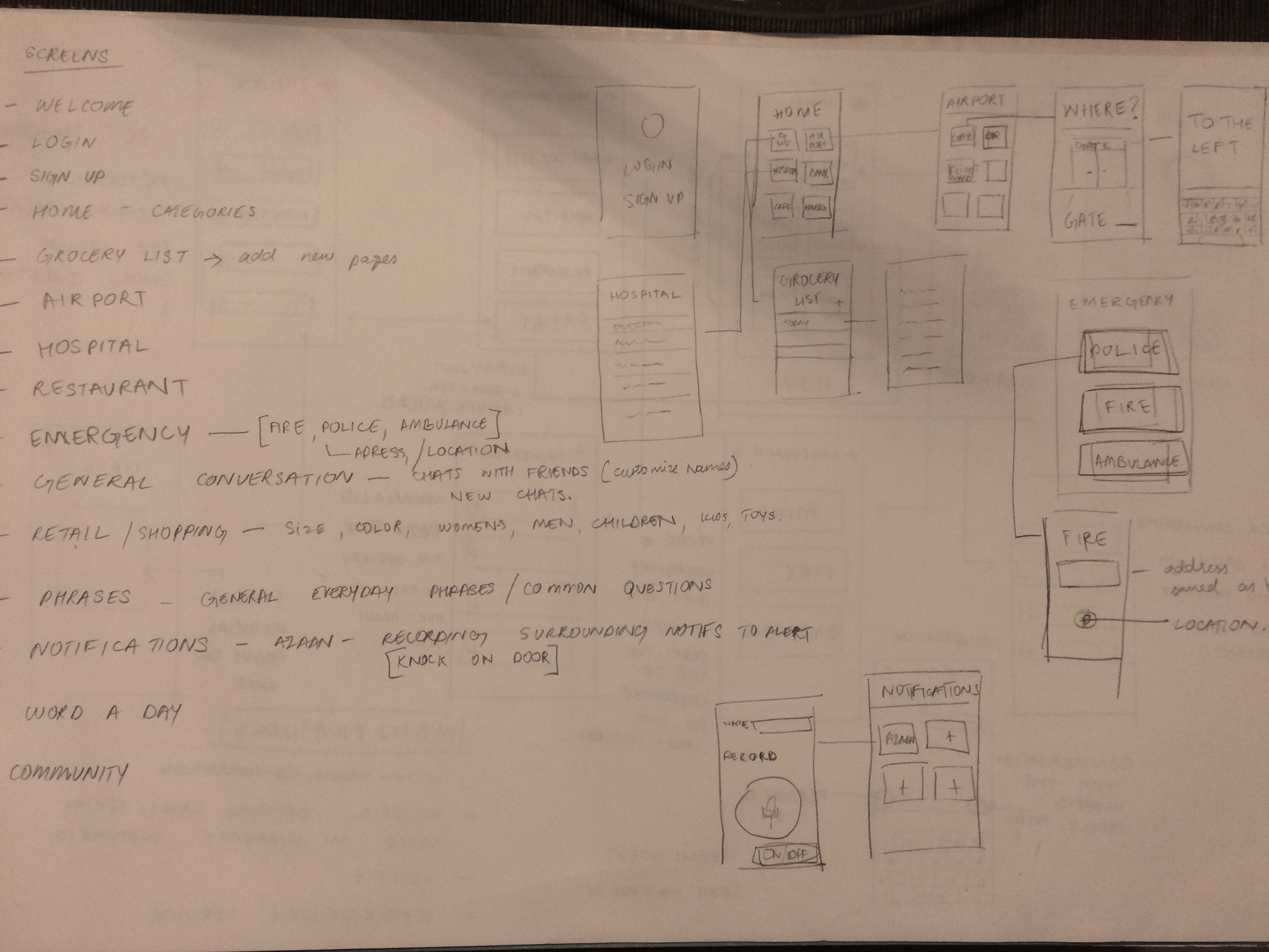
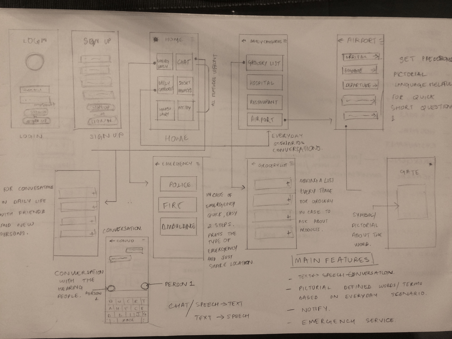
Initially the designs were made as flat vectors. which were later finally translated into 3 Dimensional Pictorials, modeled and rendered in 3d.
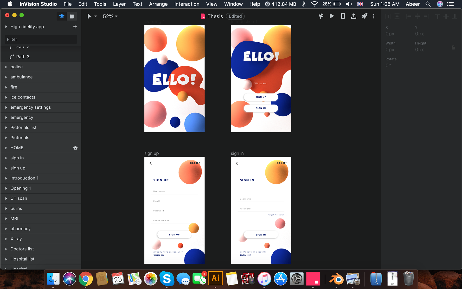
Working on the UI (User Interface). Translating the wireframes and low fidelity app designs into finished High fidelity application with all the features and pictorials that were pre-designed, placed and fitted into the final. Arranging into a prototype of the final app.
